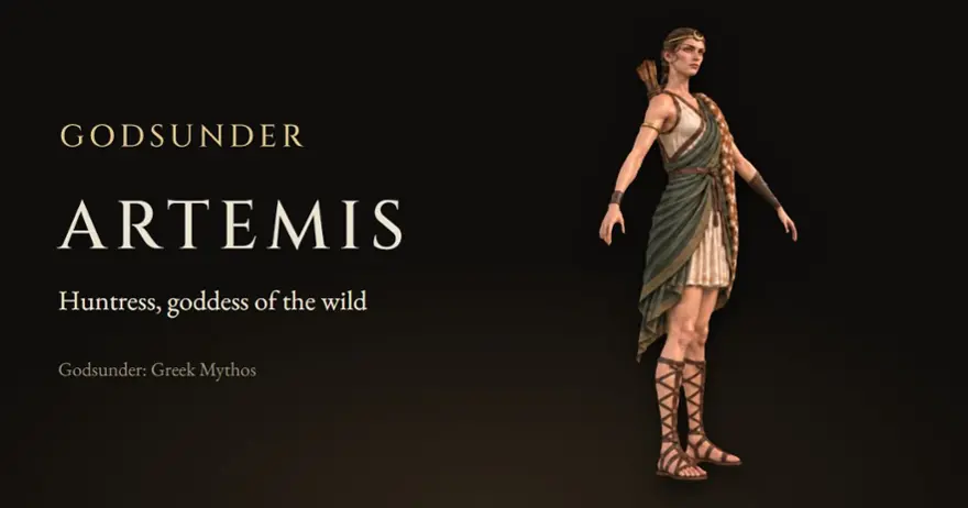
Choosing a look: why heightened realism
We tested six art styles on one goddess. Here is the one we chose for Godsunder, and why.
Before the first god was finished, Godsunder had to answer a question every game does: what should it look like?
We tested six directions on the same character, Artemis: heightened realism, stylised realism, dark gothic realism, a hand-painted look, anime cel-shading, and the painterly style the first sheets were drawn in. Each one had to work not just for Greece but for every culture the series will reach, and for monsters as well as gods.
Why heightened realism
We chose heightened realism: realistic anatomy and proportions, true-to-life metal, leather, cloth and stone, and faces that are realistic but slightly idealised, under soft, even light. It's the look of the big fantasy RPGs that players have embraced in recent years, and it reads well at the tactical distance the camera spends most of its time at.
It also suits how the game is built. Every character is drawn to be turned into a 3D model, and clean, realistic surfaces carry over to 3D better than painted ones, where the light is part of the picture.
What it means for the characters
Every character sheet was redrawn in the new style, and every new god is drawn in it from the start. The characters page shows the result.